Mono-printing is just one of many printmaking methods. Some love it and others hate it. I know one printmaker who loathes monoprints and monotypes. What he doesn't like about it is the absence of a 'matrix.' By that he means some repeatable structure. That's what monoprints are about - they are one-of-a-kind images. (Note: A monoprint does have a repeatable image, a monotype does not have a repeatable image. Inthis post, I'm not distinguishing between them although there is a difference).
What I like about them is the artist has to give over control of the images to the press. With practice, the print maker develops greater skill with laying ink on the plate, using the right paper and so forth. Yet, when the plate runs through the press, you've given up total control over the image making process. I love that that is part of the print making process. It's alchemy.
Monoprinting is without a doubt the most 'painterly' printmaking method. It allows the artist to combine all sorts of additive and subtractive processes and methods as well as 'tools' ranging from rollers called breyers to cotton swabs and everything in between. Whatever serves the artist in executing an image is fair game.
Even though mono-printing is as the name implies a singular image, that image itself may be developed using one run through the press or multiple runs through the press. Layering thin layers of ink nad building up an image can produce some quite lovely results.
Saturday, December 26, 2009
Friday, December 11, 2009
Color and Composition
Not too long ago, I was having a short conversation about color and was making a point about color being different from composition. The woman I was talking with asked "isn't color also composition?" Darn good question.
Yes and no.
Matisse is a good one to turn to on this topic. He was at least somewhat known as one who had some painting that focused on color and others where he focused on composition. Perhaps turn also to Papa Cezanne. It's much easier to see his focus on composition as there's isn't the same riot of color going on as there is with Matisse.
It's easier to approach this topic from the vantage point of black & white photography. This strips the picture plane down to the organization of various shapes in shades of grey. Color is monochromatic in a b & w image. Here we can then focus on how various shapes are arranged in that two-dimensional plane.
Can't color also be a way to organize shapes in a picture plane? It sure can. We're back to Matisse for one. Here's the thing though, if you're able to see past the color to that actual organization of shapes in the picture plane, you might find that the basic structure of the painting is flawed. Since we're so reactive to color, its easier to disguise lousy composition when using color than when painting monochromatically.
It's true that knowing some elements of Color Theory can help you play with composition using color. For example, warm colors generally come forward and cool colors generally recede. Large shapes generally come forward and small shapes generally recede. Knowing this, you can put a large cool shape in front of a smaller warm shape (not overlapping) and play with the rules to achieve more tension in your painting. This is but one example of using the rules and 'breaking' them in the aim of more effectively reaching your goal.
Sunday, December 6, 2009
Society Sucks, Product and Process, and the Well-Fed Artist
The term postmodernism is used in a confusing variety of ways. For some it means anti-modern; for others it means the revision of modernist premises. It avoids, as much as possible, the modernist desire to classify. Postmodernism partakes of uncertainty, insecurity, doubt, and accepts ambiguity.
The seemingly anti-modern stance involves a basic rejection of the tenets of Modernism - a rejection of reason, the notion of truth, the belief that it’s possible to create a better, if not perfect, society. This view has been termed Deconstructive Postmodernism. An alternative understanding, which seeks to revise the premises of Modernism, has been termed Constructive Postmodernism.
Maybe the entire film by the Coen Brothers, The Big Labowsky, reflected these competing themes. There's The Dude and his life. Then, there's Juliane Moore's character Maude. And, who can forget Bunny, especially the scene where she asks The Dude to blow on her freshly painted toenails to help dry them, and he turns towards the pool then asks her "won't he mind?" (turning his head towards the pool to bring the passed out guy into view) with Bunny responding "Uli doesn't care about anything. He's a nihilist."
The Surrealists (the Dali variety) had the modernist belief that their art could influence human destiny. Later, after the war and in the period when humankind could be obliterated, surrealism of a different sort emerged (the Tapias variety). Now, we have such practitioners as Keifer. Maybe you wouldn't put him in the surrealist camp, but I find his work to be consistent with that view of human-kind.
In June 1970, the French writer Jean Clay observed: "It is clear that we are witnessing the death throes of the cultural system maintained by the bourgeoisie in its galleries and its museums." Well, that certainly seems debatable. I do agree that the church, aristocracy, and state were being replaced by a rising group who came along with the rise of a professional middle-class. Also, we have seen a growth in Outsider Art, and street art of all sorts. Yet, it's hard for me to see that Clay's observation as more fantasy than reality. Though, Conceptual art helped to turn our attention towards "making" and the manipulation of materials where process was the product, there's the artist Dove Bradshaw who produces 'things' that are themselves about process and that change and degrade with time.
We can continue this line to include all of performance art including the “Happenings” of the post-WWII era, the Arte Povera and Arte Brut movements, Abstract Expressionism, and so forth. Yet, even here, a society that values the object as our does exerts a tremendously powerful force in the art world. That along with artist's desire to both make good work and live in heated spaces and have good food!
Modernism, Hope and Art for Art's Sake
Recently, I was in a discussion with several people about Modernism that motivated me to do some research on that term and Post-Modernism. Upon reflection, I see Modernism covering a period of about the 19th century to the present day, with some influence from Post-Modernism as a separate thread. In what follows, I’ve edited several references, deleting material that didn’t seem pertinent to our discussion. I also added some of my own commentary.
One aspect of Modernism that makes a great deal of sense to me is how it’s a reflection of the culture of the day. I like a piece from Wiki that “The term (Modernism) is usually associated with art in which the traditions of the past have been thrown aside in a spirit of experimentation. Modern artists experimented with new ways of seeing and with fresh ideas about the nature of materials and functions of art. A tendency toward abstraction is characteristic of much modern art. More recent artistic production is often called Contemporary art or Postmodern art.”
One writer speaks of it broad cultural terms noting that “social, economic, and cultural life in the widest sense [was] revolutionized by modernity ... [this means] that modernist art is scarcely thinkable outside the context of the modernized society of the late nineteenth and twentieth centuries. Cahoone 1996, p. 13.
Wiki, continues noting that Modernism “in its broadest definition, is modern thought, character, or practice. More specifically, the term describes both a set of cultural tendencies and an array of associated cultural movements, originally arising from wide-scale and far-reaching changes to Western society in the late nineteenth and early twentieth centuries. The term encompasses the activities and output of those who felt the "traditional" forms of art, architecture, literature, religious faith, social organization and daily life were becoming outdated in the new economic, social and political conditions of an emerging fully industrialized world.” What I like about this focus on broad life is it puts art in a cultural context and recognizes that art resides in a cultural context. This doesn’t mean that art follows culture, it’s more inter-active than that – sometimes art forecasts cultural developments. One aspect of WIki’s treatment of this term that strikes me as particularly pertinent is the role of Modernism in rejecting the “lingering certainty of Enlightenment thinking, and also that of the existence of a compassionate, all-powerful Creator.”
I personally appreciate this aspect of Modernism – that Modern Art has an interest in questioning existence and the certainty of existence. It also raises the question of whether there ever can be an objective reality. My personal opinion is that such a thing simply doesn’t exist. Wiki also touches on another salient aspect of Modernism – “…experiments with form, and work that draws attention to the processes and materials used (and to the further tendency of abstraction).” Arte Povera and Arte Brute are two related genres genre where process and materials are at the heart of visual expression.
In this reference, the writer makes an interesting distinction between historians in general and art historians, noting that historians (not art historians) say “the modern period actually begins with the Renaissance.” This is certainly my perspective – that the modern era began, in the West at least, at the time when science and technology, and a secular humanism, began to exert a strong influence over life. (As an aside, if you ever have the opportunity, travel to Florence and see for yourself the birth of the Renaissance in the form of the dome to the Duomo and the greatest storehouse of Renaissance Art in Florence generally and The Uffizi Gallery in particular.)
Arguments today about faith versus reason (a false dichotomy in my view), debates about evolution, “intelligent design,” religious beliefs and social organization, first arose as issues with the Renaissance. This same reference puts this issue thus, “The Enlightenment was an intellectual movement for which the most immediate stimulus was the so-called Scientific Revolution of the 17th and early 18th centuries when men like Galileo Galilei and Isaac Newton, through the application of reason to the study of Nature (i.e. our world and the heavens) had made spectacular scientific discoveries in which were revealed various scientific truths.”
Generally speaking, Progressive Modernism tended to concern itself with political and social issues. It concerned itself with the plight of the poor, that an increasingly complacent middle class ignored. Progressives repeatedly drew attention to the political and social ills of contemporary society, Fundamentally, the intention was to educate the public, to keep alive in the face of conservative forces the Enlightenment ideals of freedom and equality through which the world would be made a better place. The position taken by Progressive Modernism came to be referred to as the avant-garde (a military term meaning "advance-guard"). In contrast to conservative modernists who looked to the past and tradition, the avant-garde artist consciously rejected tradition. The avant-garde artist saw him- or herself as standing at the head of a new tradition stretching, hopefully, into the future. The Progressive Modernist looked to the future while the conservative modernist looked to the past.
This is particularly pertinent to visual art, such as it is, in Wallowa County today. While there’s a great deal of visual art in the county (2-D and 3-D) it’s of a very narrow focus and little if any of it would even remotely be considered part of the avant-garde. I find helpful to take a step back and look at the broader cultural and political forces at work that shape visual expression. This helps me understand the limited scope visual expression takes in the County. It’s also worthwhile to take stock of what cultural values it supports if not outright then by de-facto means.
Historically, the avant-garde is liberal in its support of freedom of expression and demands of equality. Since the 18th century, the modernist belief in the freedom of expression has manifested itself in art through claims to freedom of choice in subject matter and to freedom of choice in style ( of subject matter, brushstroke and color, materials, and so forth).
As the 19th century progressed, the exercise of artistic freedom became fundamental to Progressive Modernism. Artists began to seek freedom not just from the rules of academic art, but from the demands of the public. Soon it was claimed that art should be produced not for the public's sake, but for art's sake. This is a crucial step and one that may people have difficulty accepting and undertstanding to this day. Yet, this is an immense step, no less so than that represented by cubism, the use of color by Matisse, or advances in science, including Relativity Theory.
Art for Art's Sake is basically a call to release art from having to defend it's existence by appealing to meaning and purpose for it's viewer. While I support the notion of “Art for Art’s Sake,” its not an alternative to being concerned with social, cultural, or moral issues. Rather, art doesn’t need to justify its existence. In his 1891 essay "The Soul of Man Under Socialism", Oscar Wilde wrote: “A work of art is the unique result of a unique temperament. Its beauty comes from the fact that the author is what he is. It has nothing to do with the fact that other people want what they want. Indeed, the moment that an artist takes notice of what other people want, and tries to supply the demand, he ceases to be an artist, and becomes a dull or an amusing craftsman, an honest or dishonest tradesman. He has no further claim to be considered as an artist.”
In the late 19th century, art was to be discussed in terms of style -- color, line, shape, space, composition -- conveniently ignoring or playing down whatever social, political, or progressive statements the artist had hoped to make in his or her work. This has a role to be sure. However, it needs to be leavened by a focus on content. What is the emotion of the piece? What is the story of the piece? Surely, visual artists as diverse as Goya, Picasso, Schnabel, to name but a few, produced art that arose form a cultural context and was their respective commentary on that cultural context.
Friday, December 4, 2009
Beauty in Art
Talk about a topic that’s generated a great deal of heat over the ages! What is beautiful in art for me is what rings true. It’s about the artist putting him/herself out there and creating work that has a truth about it. This has nothing to do with it being pleasant, pastoral, dreamy, how long it'll last, or what have you. It’s got to do with it manifesting the artist’s truth.
In contrast, David Hume wrote that “Beauty ... in things ... exists merely in the mind which contemplates them. “ From this perspective, beauty is not in the thing or how it’s executed but in the viewer. No doubt we all have our list of what’s beautiful in life and art and what is not. Hume places a good deal of authority over what is and is not beauty in the viewer. That troubles me. We have far too many examples of what constitutes beauty in art changing as the viewer’s view of the work changes over time. The art itself hasn’t changed, only how it is ‘seen.’ Picasso’s perspective on this is closer to my heart: “Art is not the application of a cannon of beauty but what the instinct and the brain can conceive beyond any canon.”
Agnes Martin’s statement that “All artwork is about beauty: all positive work represents it and celebrates it. All negative art protests the lack of beauty in our lives." She gives me pause, though I’m not sure about her distinction between positive and negative. Elane Scarry touches on this notion of truth when she writes “Beauty incites the desire for truth.” Hum…”Beauty incites the desire for truth.” Why not, Truth is what is Beautiful?
Neal Benezra brings up a good point – confusion among the viewing public about what constitutes beauty. He writes “The assault on beauty by the contemporary art world has left a confused and baffled art-viewing public uncertain about one of the very cornerstones of Western art and culture, namely, the pursuit of beauty.” So? Maybe the problem lies in a public having that as the cornerstone of Western art and culture!?” Beauty is a cornerstone when viewers seek and demand honesty from artists as the standard of whether a particular piece constitutes beauty.
A passage from Oscar Wilde draws me in. In his 1891 essay "The Soul of Man Under Socialism", he wrote: “A work of art is the unique result of a unique temperament. Its beauty comes from the fact that the author is what he is. It has nothing to do with the fact that other people want what they want.”
Art that is based more on sentimentality is not beautiful art, even if its technically well executed or in its execution attempts to pay homage to natural imagery. Where I live, Joseph, a small town in the mountains of Northeast Oregon, there's a good deal of well executed art, art that shows a level of understanding, if not mastery of materials and technique. Sadly, the vast majority of it is all too saccharine, it being virtually about nothing else but sentimentality and strangely playing homage to a romanticized past. While copying from Nature is a time honored method, and certainly many consider it beautiful art, what does it tell us about Nature or her processes? What does it show us that we didn't already know? Works may show us the artist's facility with some media, show technical proficiency, and the artist's intellect. What does it reveal to us about the artist's heart and soul? How much of his/her heart and soul has the artist allowed us to see? If, on the other had, you have affirmative answers to these questions, then the artist has been effective at manifesting his/her intentions and that's sheer beauty.
Saturday, October 17, 2009
Contemporary Chinese Design - Portland Art Museum
Yesterday I visited the special exhibit at the Portland Art Museum on contemporary design in China. What really impressed me is how well laid out the exhibit it - they used space very well. What also impressed me is how well they placed contemporary design in a political-historical context. A friend of mine who was raised in China said she was disappointed at how commercial the exhibit is, though she realizes that just is part of the deal with a focus on design.
Two themes I found fascinating is that it took about two decades after economic liberalization for urban people to get a real feel for the concept of individuality. For obvious reasons we take that for granted. A second, and related, theme is that since there was no need for distinguishing oneself from the masses, and there have been historical reasons to avoid doing that, design is a part of that competitive process. Here again, we take these ideas so much for granted that we're really not able to see just how important they are.
Two themes I found fascinating is that it took about two decades after economic liberalization for urban people to get a real feel for the concept of individuality. For obvious reasons we take that for granted. A second, and related, theme is that since there was no need for distinguishing oneself from the masses, and there have been historical reasons to avoid doing that, design is a part of that competitive process. Here again, we take these ideas so much for granted that we're really not able to see just how important they are.
Monday, September 28, 2009
Using Historically Unconventional Materials - Europe and America
IMPACT OF ARTE POVERA MOVEMENT
The Arte Povera Movement started in Italy (hence the Italian) after WWII. It began about the same time that Abstract Expressionism exploded in America. Some writing about Arte Povera dates it to the 60's. I think it began earlier than that. The link for Arte Povera is a good, short, overview of this movement.
As far as I know, this was the beginning of what is now quite common - using materials to make art that are not historically used to make art.
SELECTED CONTEMPORARY EUROPEAN ARTISTS - UNCONVENTIONAL MATERIALS
The list of artists on the Arte Povera link is not a thorough one. Three artists I'd like to focus on, that I see as doing work consistent with this movement, are Antonio Tapies, Antonio Clave, and Anslem Kiefer. Click on the links to see some images.
Tapies and Clave are from Spain and Kiefer is from Germany. They each have extensively explored the life around them, it's history, politics, and culture. Kiefer who now lives in France has used landscape as part of his exploration of German history, including a fair amount of focus on the Holocaust. To help carry their message, they each combine found and/or discarded objects in their work. This can range from paper, plants, ladders, tools, to more risky materials like lead. I find each of their work breathtaking. They just are stunning. I find Tapies' work to be more remote, more intellectually challenging, than either Clave's or that of Kiefer. Kiefer's works are usually monumental in scale and they can just suck the air out of a room.
SELECTED CONTEMPORARY AMERICAN ARTISTS - UNCONVENTIONAL MATERIALS
The Abstract Expressionist in America also used unconventional materials in their paintings. Though, they carry a different emotional weight than the Europeans. American contemporary 2-D art is thought of as having a great concern with surface. There's also an optimism that comes through in contrast to the Europeans. Though, at the same time, the American work in my view has less sense of history about it, with some exceptions. Many more artists and movements followed who continued using unconventional materials. Here are but a few names: Jim Dine, Kiki Smith, Julian Schnabel, Robert Rauschenberg, Eva Hessse, Frank Stella, Julian Schnabel, Dove Bradshaw, Red Grooms, and Cy Twombly. Today, anything goes.
ART AS PROCESS
Another theme connecting these works is the theme of art as process. Modern contemporary art has this thread running through it, to lesser and larger degrees. This shows up in Diebenkorn's work as a road map of his creative process of reworking a painting. It shows up in the works of John Cage and Dove Bradshaw as the point of their work - exploring time, chance, chaos. One can also throw in the performance work of such people as Rauschenberg who explored performance as art at its inception. Kiefer's and Tapies's finished work manifests a great deal of process, with some Tapies's work crossing over into calligraphy.
Thursday, September 24, 2009
A Day Revising One Painting - Color as Composition
Today was a good painting day. I reworked one painting. The former version appears first, and the revised painting lies below it. There might be some slight variation in photo exposure that is also a play here; but, largely how the colors that I did not change appear reflects the concept of relative color. Absolute color does not exist!
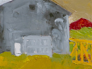
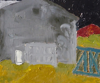
There are three changes in color between these two paintings - the 'sky,' the 'rail car' and the background for the 'rail car.'
SCIENTIFIC ADVANCES IN UNDERSTANDING HOW WE SEE COLOR INFLUENCES PAINTING
Before science led to breakthroughs in the understanding of how the eye see and the brain interprets color, there was not an understanding that color was relative. The brain "sees" color in groups, not singularly. It's really quite a fascinating area, receptors in the eye, mapping to the brain and all that. Neo-Impressionists became aware of these scientific advances and used them in their work. One very clear example is the Pointillism of Seurat.
TODAY'S TASK
My task today was to see what I could do to make the painting work. What I mean by that is the painting has to 'work as a painting' within the confines of the rectangle I am using, which in this case is 16" x 20." Whatever exists in Nature is quite apart from the painting working as a painting. Aside from changing several colors, there were also a few, small, compositional changes I wanted to make to hopefully add to the ambiguity of the painting - to make the space more ambiguous.
WHAT CHANGED
First, I extended the cross-hatch and horizontals of the rail car motif in the lower right to extend it beyond the vertical of the building. I did not add a vertical to the rail car so as to enhance ambiguity about what was in front of what.
Next, I changed the background behind the rail car using a dark, warm, green to separate that background from the area directly above it.
Then I changed the sky color to a dark blackish purple in the hopes this would create an illusion of infinite space behind. After that, the color of the rail car no longer worked, as I had changed it from it original orange-yellow to a tertiary warmish - brown. Eventually, I settled on a steely blue. This helps to separate the 'rail car' from the warm tones surrounding it, and as I used the sky color as the base, adding white, there's a tie in between it and the sky.
Right now, I like where the painting's at...we'll see if I feel the same tomorrow!
In a forthcoming post, I'll address the issue of warm vs. cool color and light vs. dark color.
Wednesday, September 23, 2009
Encaustic, Sumi Ink, and Cigar Boxes


One of the oldest painting mediums known in western art (excluding cave painting) is using melted wax known generally as encaustic. It's just a wonderful medium that allows for much play and creativity.
ART MADE FROM DISCARDED MATTER
There is much art that uses discarded materials. It's been coined the Arte Povera movement. It's had many practitioners, two of which are Anslem Kiefer and Antonio Tapies. To be sure, these two artists had more to say than what materials can be used to make art.
MY USE OF DISCARDED MATERIAL
I've used all sorts of materials in paintings - steel beer cans, old shirts, old twine, bones, straw to name a few items. Two examples of how I've been using discarded materials with encaustic appear above. These two pieces are examples of a series I've worked up using discarded Chinese calligraphy practice sheets of mine and used cigar boxes. The calligraphy scraps are 'glued' together using multiple thin coats of encaustic (melted wax) and I sometimes add powered or melted pigment to the wax or apply it over oil paint (yes, this does work). As wax is applied to the Chinese rice paper, the rice paper becomes translucent, which allows lower layers to appear on the surface, albeit somewhat muted.
SIDE NOTE - CHINESE CALLIGRAPHY AND PAINTING
I've practiced Chinese calligraphy with a wonderful contemporary Chinese artist, Wang Gongyi (gong-yee). In Asia, calligraphy is the highest of arts; It ranks above painting. Chinese landscape painting has its foundation in calligraphy.
USING CIGAR BOXES IN FINE ART
Cigar boxes have been used by artists for quite some time. In the 90's, there was a stunning show of Richard Diebenkorn's work at San Francisco Museum of Modern Art (SFMOMA). A small part of that show included some of his paintings executed on the lids of cigar boxes. Nowadays cigar boxes aren't the cheap painting support they once were. Maybe partly since people also use them to make purses, guitars, and what's called 'tramp art.' Thankfully for me, I can get a hold of them without smoking cigars!
Tuesday, September 22, 2009
Welcome

Welcome to my blog! This is a blog devoted primarily to art. At least for while, I'll probably also include posts focusing on the environs in and around this amazing place - Joseph, Oregon. One example is the picture to the left taken from my front porch of a local walking two of his sheep down the street.
After arriving here in Joseph in mid June, I got around to painting by September. Ah, what's the rush? Much to move, unpack, adjust to, read, read, read, hike, snooze, do a bunch of writing, and so forth.
The summer was cooler and wetter than normal. No complaints from me on that regard. The hottest it got here were just a few days in the low 90's with a much wetter August than is normal. Now, summer's turned into fall. We've had several nights below 32F and people have begun to drape their tomato plants with plastic, as at this elevation the tomatoes are just
beginning to ripen.
Up around 5,500' the Aspen and Larch are just beginning to turn. We are still enjoying warm days in the 70's to 80's and sunny dawn to dusk with cool, clear nights. Perfect weather by me.
The next picture was taken on an unseasonably cool and overcast August day from atop the East Moraine looking south down the length of Wallowa Lake towards Bonneville Mountain,

the triangular peak in the center of the photo. These moraines are known the world over
to those who study glaciers. They are considered some of the most classic examples of lateral moraines. A lateral moraine is the pile of rock and earth created by a glacier's movement and mark the left and right boundary of the glacier's path.
Behind Bonneville Mountain you can barely make out the ridge upon ridge of peaks that are part of the Eagle Cap Wilderness, the largest wilderness in Oregon. Some still have visible snow patches on them in mid-August. Between the clear light, mountain peaks and valleys, multi-hued canyons, the deepest gorge in North America, farms and ranches, and the largest native grass prairie in the lower 48, there is no lack of stunning vistas from which to find inspiration.
TWO PAINTINGS
One of the HOT local issues is a decision by county commissioners who signed a contract to accept over 700 rail cars (a 30 miles long train) for three years for $59,000 a month. It's created a fair bit of heat, especially since there was no real, honest, public process before signing the contract.

My view is that there an eyesore not only because they blight the landscape but because a huge amount of trash has come in on the cars - all sorts of debris. There presence here is a manifestation of a significant problem - a lack of understanding of the importance of public process and how real process can help improve decision-making. You wouldn't find them parked over by Sun Valley (o.k., Sun Valley converted it's rail line to a bike and hike path) or Jackson, WY. Nope, it's poorer places that take other people's refuse be that in the form of surplus rail cars, spent nuclear waste, or trash. My first image including rail cars is titled "A necklace of 10,000 rail cars encircle Ruby Peak." It's given me some ideas for further treatments of this imagery.
PAINTING ALONG THE WILLAMETTE RIVER
PAINTING ALONG THE WILLAMETTE RIVER

A separate painting recently completed was begun in the Portland area, along the Willamette River, south of Portland proper. The spot where this painting was begun is a lovely park at water's edge with an old abandoned train trestle with just wonderful views up, down, and across the river. Both these pieces use knives rather than brushes for the vast majority of each image.

MY INTENTION WITH THESE PAINTINGS
My basic interest is in:
- Building up the surface with multiple paint layers;
- Flat images devoid of linear perspective;
- Exclude shadow
- Capture a childlike nature.
READING MY IMAGES
These images are read like Chinese landscape paintings - as you move up through the picture plane, you are moving back in space. This technique is also used in Japanese woodblock prints (I'm especially drawn to the woodblock prints of Hokusai and Hiroshige). My images abstract detail even more, and like their imagery, I'm not too concerned about local color, as you can see! My interest lies more with form, texture, and the use of color to define form and trigger feelings in the viewer. The first of these two paintings uses a fairly tight value and intensity range, using hue to delineate form. It's a more static image than the second painting which has a broader intensity and value range and a compositional device to add even more movement.
These images are read like Chinese landscape paintings - as you move up through the picture plane, you are moving back in space. This technique is also used in Japanese woodblock prints (I'm especially drawn to the woodblock prints of Hokusai and Hiroshige). My images abstract detail even more, and like their imagery, I'm not too concerned about local color, as you can see! My interest lies more with form, texture, and the use of color to define form and trigger feelings in the viewer. The first of these two paintings uses a fairly tight value and intensity range, using hue to delineate form. It's a more static image than the second painting which has a broader intensity and value range and a compositional device to add even more movement.
Subscribe to:
Posts (Atom)


