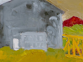
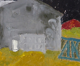
Today was a good painting day. I reworked one painting. The former version appears first, and the revised painting lies below it. There might be some slight variation in photo exposure that is also a play here; but, largely how the colors that I did not change appear reflects the concept of relative color. Absolute color does not exist!


There are three changes in color between these two paintings - the 'sky,' the 'rail car' and the background for the 'rail car.'
SCIENTIFIC ADVANCES IN UNDERSTANDING HOW WE SEE COLOR INFLUENCES PAINTING
Before science led to breakthroughs in the understanding of how the eye see and the brain interprets color, there was not an understanding that color was relative. The brain "sees" color in groups, not singularly. It's really quite a fascinating area, receptors in the eye, mapping to the brain and all that. Neo-Impressionists became aware of these scientific advances and used them in their work. One very clear example is the Pointillism of Seurat.
TODAY'S TASK
My task today was to see what I could do to make the painting work. What I mean by that is the painting has to 'work as a painting' within the confines of the rectangle I am using, which in this case is 16" x 20." Whatever exists in Nature is quite apart from the painting working as a painting. Aside from changing several colors, there were also a few, small, compositional changes I wanted to make to hopefully add to the ambiguity of the painting - to make the space more ambiguous.
WHAT CHANGED
First, I extended the cross-hatch and horizontals of the rail car motif in the lower right to extend it beyond the vertical of the building. I did not add a vertical to the rail car so as to enhance ambiguity about what was in front of what.
Next, I changed the background behind the rail car using a dark, warm, green to separate that background from the area directly above it.
Then I changed the sky color to a dark blackish purple in the hopes this would create an illusion of infinite space behind. After that, the color of the rail car no longer worked, as I had changed it from it original orange-yellow to a tertiary warmish - brown. Eventually, I settled on a steely blue. This helps to separate the 'rail car' from the warm tones surrounding it, and as I used the sky color as the base, adding white, there's a tie in between it and the sky.
Right now, I like where the painting's at...we'll see if I feel the same tomorrow!
In a forthcoming post, I'll address the issue of warm vs. cool color and light vs. dark color.


Hi Bob,
ReplyDeletevery cool. Makes me want to spend all day looking through the links. Course, I don't have all day, but I'll look.
Jef