Yesterday I visited the special exhibit at the Portland Art Museum on contemporary design in China. What really impressed me is how well laid out the exhibit it - they used space very well. What also impressed me is how well they placed contemporary design in a political-historical context. A friend of mine who was raised in China said she was disappointed at how commercial the exhibit is, though she realizes that just is part of the deal with a focus on design.
Two themes I found fascinating is that it took about two decades after economic liberalization for urban people to get a real feel for the concept of individuality. For obvious reasons we take that for granted. A second, and related, theme is that since there was no need for distinguishing oneself from the masses, and there have been historical reasons to avoid doing that, design is a part of that competitive process. Here again, we take these ideas so much for granted that we're really not able to see just how important they are.
Saturday, October 17, 2009


Monday, September 28, 2009
Using Historically Unconventional Materials - Europe and America
IMPACT OF ARTE POVERA MOVEMENT
The Arte Povera Movement started in Italy (hence the Italian) after WWII. It began about the same time that Abstract Expressionism exploded in America. Some writing about Arte Povera dates it to the 60's. I think it began earlier than that. The link for Arte Povera is a good, short, overview of this movement.
As far as I know, this was the beginning of what is now quite common - using materials to make art that are not historically used to make art.
SELECTED CONTEMPORARY EUROPEAN ARTISTS - UNCONVENTIONAL MATERIALS
The list of artists on the Arte Povera link is not a thorough one. Three artists I'd like to focus on, that I see as doing work consistent with this movement, are Antonio Tapies, Antonio Clave, and Anslem Kiefer. Click on the links to see some images.
Tapies and Clave are from Spain and Kiefer is from Germany. They each have extensively explored the life around them, it's history, politics, and culture. Kiefer who now lives in France has used landscape as part of his exploration of German history, including a fair amount of focus on the Holocaust. To help carry their message, they each combine found and/or discarded objects in their work. This can range from paper, plants, ladders, tools, to more risky materials like lead. I find each of their work breathtaking. They just are stunning. I find Tapies' work to be more remote, more intellectually challenging, than either Clave's or that of Kiefer. Kiefer's works are usually monumental in scale and they can just suck the air out of a room.
SELECTED CONTEMPORARY AMERICAN ARTISTS - UNCONVENTIONAL MATERIALS
The Abstract Expressionist in America also used unconventional materials in their paintings. Though, they carry a different emotional weight than the Europeans. American contemporary 2-D art is thought of as having a great concern with surface. There's also an optimism that comes through in contrast to the Europeans. Though, at the same time, the American work in my view has less sense of history about it, with some exceptions. Many more artists and movements followed who continued using unconventional materials. Here are but a few names: Jim Dine, Kiki Smith, Julian Schnabel, Robert Rauschenberg, Eva Hessse, Frank Stella, Julian Schnabel, Dove Bradshaw, Red Grooms, and Cy Twombly. Today, anything goes.
ART AS PROCESS
Another theme connecting these works is the theme of art as process. Modern contemporary art has this thread running through it, to lesser and larger degrees. This shows up in Diebenkorn's work as a road map of his creative process of reworking a painting. It shows up in the works of John Cage and Dove Bradshaw as the point of their work - exploring time, chance, chaos. One can also throw in the performance work of such people as Rauschenberg who explored performance as art at its inception. Kiefer's and Tapies's finished work manifests a great deal of process, with some Tapies's work crossing over into calligraphy.
The Arte Povera Movement started in Italy (hence the Italian) after WWII. It began about the same time that Abstract Expressionism exploded in America. Some writing about Arte Povera dates it to the 60's. I think it began earlier than that. The link for Arte Povera is a good, short, overview of this movement.
As far as I know, this was the beginning of what is now quite common - using materials to make art that are not historically used to make art.
SELECTED CONTEMPORARY EUROPEAN ARTISTS - UNCONVENTIONAL MATERIALS
The list of artists on the Arte Povera link is not a thorough one. Three artists I'd like to focus on, that I see as doing work consistent with this movement, are Antonio Tapies, Antonio Clave, and Anslem Kiefer. Click on the links to see some images.
Tapies and Clave are from Spain and Kiefer is from Germany. They each have extensively explored the life around them, it's history, politics, and culture. Kiefer who now lives in France has used landscape as part of his exploration of German history, including a fair amount of focus on the Holocaust. To help carry their message, they each combine found and/or discarded objects in their work. This can range from paper, plants, ladders, tools, to more risky materials like lead. I find each of their work breathtaking. They just are stunning. I find Tapies' work to be more remote, more intellectually challenging, than either Clave's or that of Kiefer. Kiefer's works are usually monumental in scale and they can just suck the air out of a room.
SELECTED CONTEMPORARY AMERICAN ARTISTS - UNCONVENTIONAL MATERIALS
The Abstract Expressionist in America also used unconventional materials in their paintings. Though, they carry a different emotional weight than the Europeans. American contemporary 2-D art is thought of as having a great concern with surface. There's also an optimism that comes through in contrast to the Europeans. Though, at the same time, the American work in my view has less sense of history about it, with some exceptions. Many more artists and movements followed who continued using unconventional materials. Here are but a few names: Jim Dine, Kiki Smith, Julian Schnabel, Robert Rauschenberg, Eva Hessse, Frank Stella, Julian Schnabel, Dove Bradshaw, Red Grooms, and Cy Twombly. Today, anything goes.
ART AS PROCESS
Another theme connecting these works is the theme of art as process. Modern contemporary art has this thread running through it, to lesser and larger degrees. This shows up in Diebenkorn's work as a road map of his creative process of reworking a painting. It shows up in the works of John Cage and Dove Bradshaw as the point of their work - exploring time, chance, chaos. One can also throw in the performance work of such people as Rauschenberg who explored performance as art at its inception. Kiefer's and Tapies's finished work manifests a great deal of process, with some Tapies's work crossing over into calligraphy.
Thursday, September 24, 2009
A Day Revising One Painting - Color as Composition
Today was a good painting day. I reworked one painting. The former version appears first, and the revised painting lies below it. There might be some slight variation in photo exposure that is also a play here; but, largely how the colors that I did not change appear reflects the concept of relative color. Absolute color does not exist!
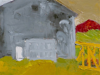
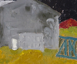
There are three changes in color between these two paintings - the 'sky,' the 'rail car' and the background for the 'rail car.'
SCIENTIFIC ADVANCES IN UNDERSTANDING HOW WE SEE COLOR INFLUENCES PAINTING
Before science led to breakthroughs in the understanding of how the eye see and the brain interprets color, there was not an understanding that color was relative. The brain "sees" color in groups, not singularly. It's really quite a fascinating area, receptors in the eye, mapping to the brain and all that. Neo-Impressionists became aware of these scientific advances and used them in their work. One very clear example is the Pointillism of Seurat.
TODAY'S TASK
My task today was to see what I could do to make the painting work. What I mean by that is the painting has to 'work as a painting' within the confines of the rectangle I am using, which in this case is 16" x 20." Whatever exists in Nature is quite apart from the painting working as a painting. Aside from changing several colors, there were also a few, small, compositional changes I wanted to make to hopefully add to the ambiguity of the painting - to make the space more ambiguous.
WHAT CHANGED
First, I extended the cross-hatch and horizontals of the rail car motif in the lower right to extend it beyond the vertical of the building. I did not add a vertical to the rail car so as to enhance ambiguity about what was in front of what.
Next, I changed the background behind the rail car using a dark, warm, green to separate that background from the area directly above it.
Then I changed the sky color to a dark blackish purple in the hopes this would create an illusion of infinite space behind. After that, the color of the rail car no longer worked, as I had changed it from it original orange-yellow to a tertiary warmish - brown. Eventually, I settled on a steely blue. This helps to separate the 'rail car' from the warm tones surrounding it, and as I used the sky color as the base, adding white, there's a tie in between it and the sky.
Next, I changed the background behind the rail car using a dark, warm, green to separate that background from the area directly above it.
Then I changed the sky color to a dark blackish purple in the hopes this would create an illusion of infinite space behind. After that, the color of the rail car no longer worked, as I had changed it from it original orange-yellow to a tertiary warmish - brown. Eventually, I settled on a steely blue. This helps to separate the 'rail car' from the warm tones surrounding it, and as I used the sky color as the base, adding white, there's a tie in between it and the sky.
Right now, I like where the painting's at...we'll see if I feel the same tomorrow!
In a forthcoming post, I'll address the issue of warm vs. cool color and light vs. dark color.
Wednesday, September 23, 2009
Encaustic, Sumi Ink, and Cigar Boxes


One of the oldest painting mediums known in western art (excluding cave painting) is using melted wax known generally as encaustic. It's just a wonderful medium that allows for much play and creativity.
ART MADE FROM DISCARDED MATTER
There is much art that uses discarded materials. It's been coined the Arte Povera movement. It's had many practitioners, two of which are Anslem Kiefer and Antonio Tapies. To be sure, these two artists had more to say than what materials can be used to make art.
MY USE OF DISCARDED MATERIAL
I've used all sorts of materials in paintings - steel beer cans, old shirts, old twine, bones, straw to name a few items. Two examples of how I've been using discarded materials with encaustic appear above. These two pieces are examples of a series I've worked up using discarded Chinese calligraphy practice sheets of mine and used cigar boxes. The calligraphy scraps are 'glued' together using multiple thin coats of encaustic (melted wax) and I sometimes add powered or melted pigment to the wax or apply it over oil paint (yes, this does work). As wax is applied to the Chinese rice paper, the rice paper becomes translucent, which allows lower layers to appear on the surface, albeit somewhat muted.
SIDE NOTE - CHINESE CALLIGRAPHY AND PAINTING
I've practiced Chinese calligraphy with a wonderful contemporary Chinese artist, Wang Gongyi (gong-yee). In Asia, calligraphy is the highest of arts; It ranks above painting. Chinese landscape painting has its foundation in calligraphy.
USING CIGAR BOXES IN FINE ART
Cigar boxes have been used by artists for quite some time. In the 90's, there was a stunning show of Richard Diebenkorn's work at San Francisco Museum of Modern Art (SFMOMA). A small part of that show included some of his paintings executed on the lids of cigar boxes. Nowadays cigar boxes aren't the cheap painting support they once were. Maybe partly since people also use them to make purses, guitars, and what's called 'tramp art.' Thankfully for me, I can get a hold of them without smoking cigars!
Tuesday, September 22, 2009
Welcome

Welcome to my blog! This is a blog devoted primarily to art. At least for while, I'll probably also include posts focusing on the environs in and around this amazing place - Joseph, Oregon. One example is the picture to the left taken from my front porch of a local walking two of his sheep down the street.
After arriving here in Joseph in mid June, I got around to painting by September. Ah, what's the rush? Much to move, unpack, adjust to, read, read, read, hike, snooze, do a bunch of writing, and so forth.
The summer was cooler and wetter than normal. No complaints from me on that regard. The hottest it got here were just a few days in the low 90's with a much wetter August than is normal. Now, summer's turned into fall. We've had several nights below 32F and people have begun to drape their tomato plants with plastic, as at this elevation the tomatoes are just
beginning to ripen.
Up around 5,500' the Aspen and Larch are just beginning to turn. We are still enjoying warm days in the 70's to 80's and sunny dawn to dusk with cool, clear nights. Perfect weather by me.
The next picture was taken on an unseasonably cool and overcast August day from atop the East Moraine looking south down the length of Wallowa Lake towards Bonneville Mountain,

the triangular peak in the center of the photo. These moraines are known the world over
to those who study glaciers. They are considered some of the most classic examples of lateral moraines. A lateral moraine is the pile of rock and earth created by a glacier's movement and mark the left and right boundary of the glacier's path.
Behind Bonneville Mountain you can barely make out the ridge upon ridge of peaks that are part of the Eagle Cap Wilderness, the largest wilderness in Oregon. Some still have visible snow patches on them in mid-August. Between the clear light, mountain peaks and valleys, multi-hued canyons, the deepest gorge in North America, farms and ranches, and the largest native grass prairie in the lower 48, there is no lack of stunning vistas from which to find inspiration.
TWO PAINTINGS
One of the HOT local issues is a decision by county commissioners who signed a contract to accept over 700 rail cars (a 30 miles long train) for three years for $59,000 a month. It's created a fair bit of heat, especially since there was no real, honest, public process before signing the contract.

My view is that there an eyesore not only because they blight the landscape but because a huge amount of trash has come in on the cars - all sorts of debris. There presence here is a manifestation of a significant problem - a lack of understanding of the importance of public process and how real process can help improve decision-making. You wouldn't find them parked over by Sun Valley (o.k., Sun Valley converted it's rail line to a bike and hike path) or Jackson, WY. Nope, it's poorer places that take other people's refuse be that in the form of surplus rail cars, spent nuclear waste, or trash. My first image including rail cars is titled "A necklace of 10,000 rail cars encircle Ruby Peak." It's given me some ideas for further treatments of this imagery.
PAINTING ALONG THE WILLAMETTE RIVER
PAINTING ALONG THE WILLAMETTE RIVER

A separate painting recently completed was begun in the Portland area, along the Willamette River, south of Portland proper. The spot where this painting was begun is a lovely park at water's edge with an old abandoned train trestle with just wonderful views up, down, and across the river. Both these pieces use knives rather than brushes for the vast majority of each image.

MY INTENTION WITH THESE PAINTINGS
My basic interest is in:
- Building up the surface with multiple paint layers;
- Flat images devoid of linear perspective;
- Exclude shadow
- Capture a childlike nature.
READING MY IMAGES
These images are read like Chinese landscape paintings - as you move up through the picture plane, you are moving back in space. This technique is also used in Japanese woodblock prints (I'm especially drawn to the woodblock prints of Hokusai and Hiroshige). My images abstract detail even more, and like their imagery, I'm not too concerned about local color, as you can see! My interest lies more with form, texture, and the use of color to define form and trigger feelings in the viewer. The first of these two paintings uses a fairly tight value and intensity range, using hue to delineate form. It's a more static image than the second painting which has a broader intensity and value range and a compositional device to add even more movement.
These images are read like Chinese landscape paintings - as you move up through the picture plane, you are moving back in space. This technique is also used in Japanese woodblock prints (I'm especially drawn to the woodblock prints of Hokusai and Hiroshige). My images abstract detail even more, and like their imagery, I'm not too concerned about local color, as you can see! My interest lies more with form, texture, and the use of color to define form and trigger feelings in the viewer. The first of these two paintings uses a fairly tight value and intensity range, using hue to delineate form. It's a more static image than the second painting which has a broader intensity and value range and a compositional device to add even more movement.
Subscribe to:
Posts (Atom)


 Posts
Posts


